Gallery
See what others have created
naafiahsarwath29
@naafiahsarwath29
Error
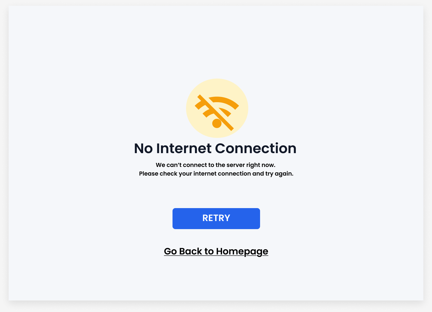
Design an error screen for a SaaS product that appears when a user action fails: submit, save, or load. Treat it as a real product state, not a generic warning page. The screen should explain what went wrong in plain language and keep the user oriented in the current flow.
Make the recovery path explicit. Include one primary action, such as Retry, Try again, or Fix fields, and one secondary action for backing out or getting help. If the error is tied to a form, preserve the entered data and point to the specific field or step that needs attention.
Use hierarchy to make the state readable fast: error title, short explanation, then actions. Add a visual treatment that supports the message, but keep it restrained. The design should feel calm, specific, and usable under failure.
What to deliver
- Design a single error screen with headline, short explanation, and primary recovery action.
- Add a secondary action for cancel, go back, or contact support.
- Include one clear visual cue for error state, such as icon or illustration.
- Show a variant for inline form error or blocking system error.
Embrace the negative space! Clear and uncluttered error messages are easier on the eyes and less stressful for users.