Gallery
See what others have created
sheeshable
@sheeshable
Button
Design a single button component that could live in a product UI, not just a standalone mock. Show the default treatment plus a clear secondary use case, such as a form submit or toolbar action, so the button has context and scale.
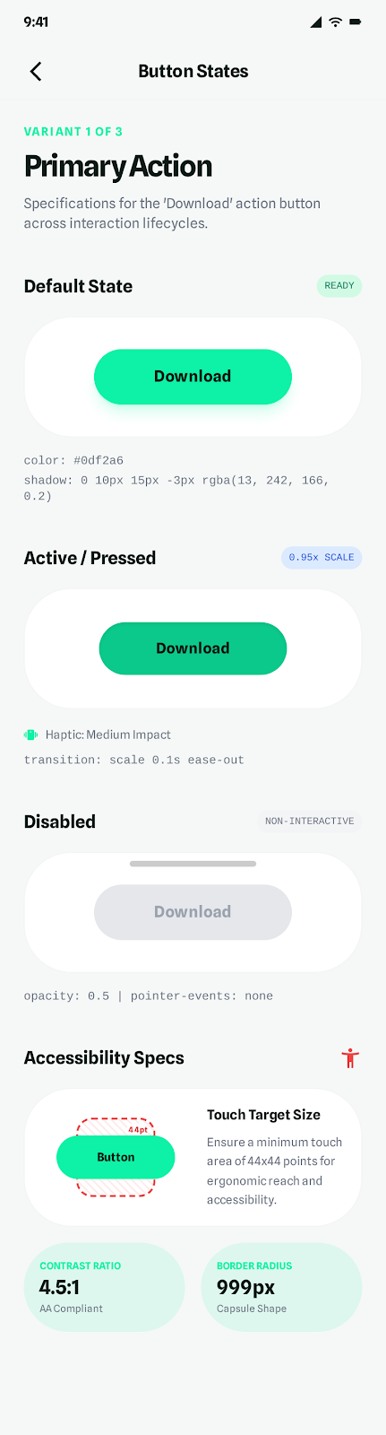
Define the core states: default, hover, pressed, disabled, and loading. Each state should feel like the same component, with changes in color, elevation, or motion that communicate interaction without shifting size or breaking alignment.
Include at least three size variants and a focus state for keyboard use. Keep the label short and specific, use a clear action verb, and make sure the button still reads at small mobile sizes and on dark or light surfaces.
What to deliver
- Design a primary button with label, icon option, and clear hierarchy.
- Define default, hover, pressed, disabled, and loading states.
- Set size variants for small, medium, and large usage.
- Specify touch target, spacing, and focus treatment.
- Show one button in a form or toolbar context.
Play with microinteractions for your button design. This could be an animated tick that appears upon a successful click or a small vibration on touch to create an engaging user experience.