Gallery
See what others have created
hatefulskirmish
@hatefulskirmish
Slider
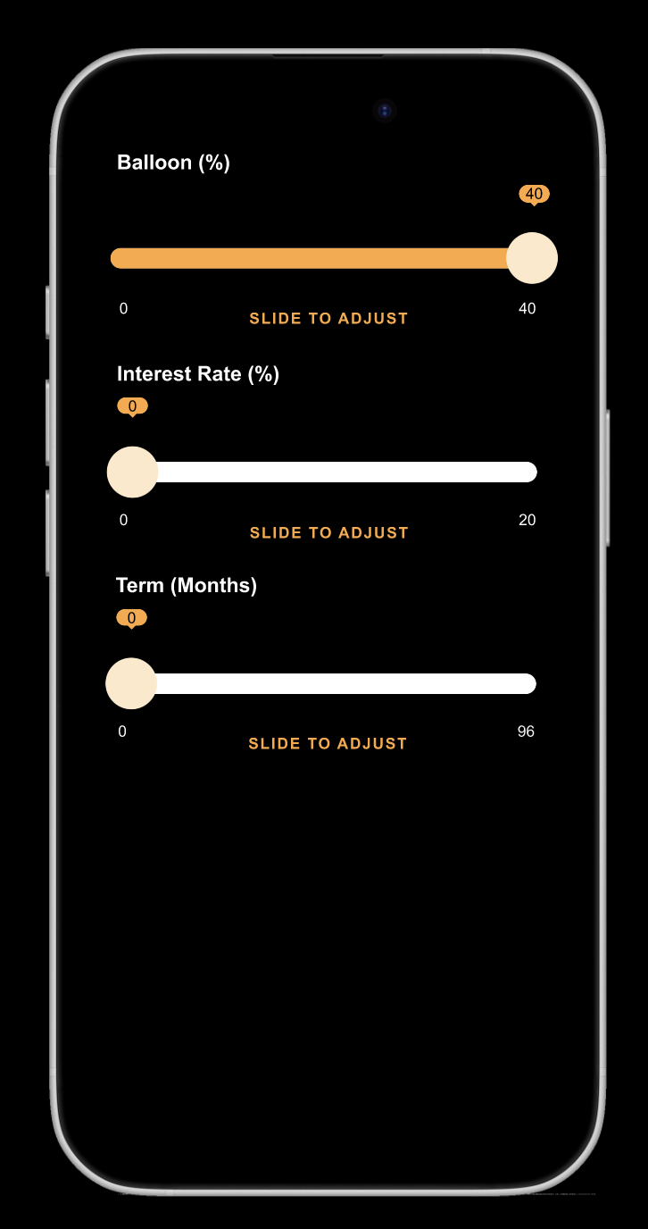
Design a slider control for adjusting a continuous value in a product UI. Treat it as a form component first: the user should understand the available range, the current value, and how to change it without guessing.
Show the default state with track, filled progress, thumb, min/max labels, and a live value readout. The control should work at a glance in a settings panel, filter bar, or pricing selector, so the value cannot rely on color alone.
Define the full interaction set: hover, focus, dragging, keyboard step changes, and disabled. If you include a range slider, make the two thumbs distinct and keep the selected span readable. Make the hit area generous enough for touch, and keep nearby labels from colliding with the thumb at small widths.
Use motion only where it helps feedback: the thumb should feel responsive, but the component should still read cleanly in a static mockup. Keep the styling aligned with the rest of the interface, but don’t bury the control under decoration.
What to deliver
- Design the default slider track, thumb, and filled progress state
- Show label, min/max values, and current value near the control
- Add hover, focus, active, and disabled states
- Include keyboard and drag interaction cues
- Provide one variant for a single-value slider and one for a range slider
Animate the sliding transitions smoothly to enhance the user experience and keep the audience captivated.