Gallery
See what others have created
hatefulskirmish
@hatefulskirmish
Segmented controls
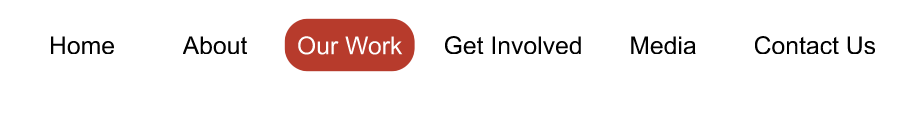
Design a segmented control for switching between closely related views or filters inside an app. Keep it small, direct, and obviously interactive. The control should read as one group, with a single selected segment and the rest clearly available.
Use 3–5 segments with concise labels. Show at least one example where the labels are short and one where they are longer, so the component’s spacing and truncation rules are clear. The selected segment should have a stronger fill or outline treatment; inactive segments should stay readable but quieter.
Include default, hover, pressed, focus, selected, and disabled states. The component should not jump in size when the selection changes. If the label set is too long for the available width, show how the control handles overflow instead of breaking the layout.
Treat keyboard and touch interaction as part of the design, not an afterthought. Focus state should be visible, hit areas should be generous, and the control should still make sense when used in dense toolbars or filter rows.
What to deliver
- Design a segmented control with 3–5 options and one selected state
- Show default, hover, pressed, selected, and disabled states
- Include a long-label variant and a compact variant
- Add keyboard focus and touch-target spacing
- Demonstrate how the control behaves when the selection changes
Incorporate subtle animations when switching between segments to offer a more engaging and responsive feel to the controls.