Gallery
See what others have created
hatefulskirmish
@hatefulskirmish
Range
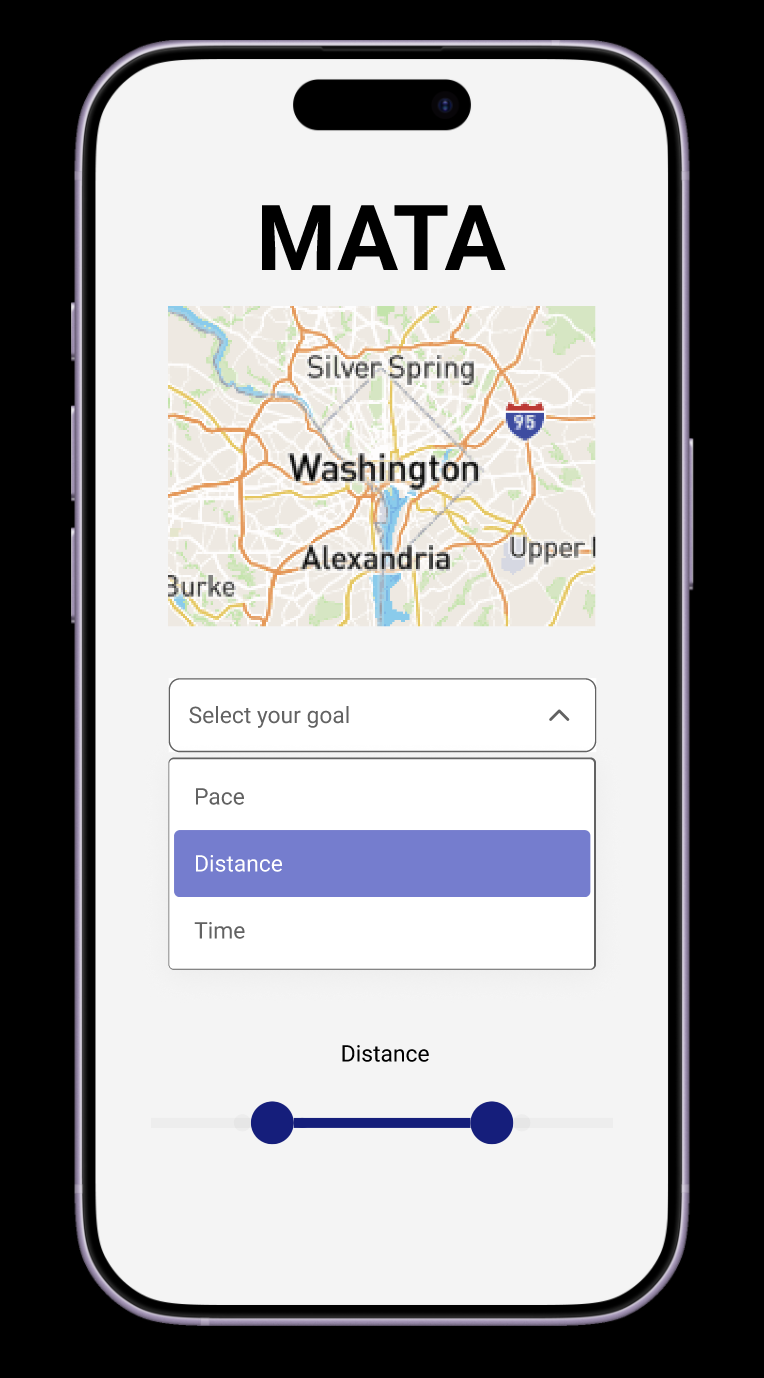
Design a single-value range control for choosing any value between a fixed minimum and maximum. Keep the pattern focused: one track, one thumb, one current value. Use it for settings like volume, price filters, or time selection, but the component itself should stay generic and reusable.
Show the full range with clear endpoints and a visible selected portion. The current value should be readable at a glance, either beside the thumb or in a linked label above the control. If the range uses discrete steps, add ticks or snap points; if it is continuous, keep the track clean and avoid unnecessary decoration.
Design the interaction states: idle, hover, focus, dragging, and disabled. Make keyboard adjustment obvious, preserve contrast in every state, and keep the thumb large enough to grab on touch devices. If the value can be edited directly, show how that input stays in sync with the slider position.
What to deliver
- Design a single-value range control with track, thumb, and value label.
- Show min, max, and current value clearly.
- Include tick marks or stops when the range needs discrete steps.
- Provide hover, focus, drag, and disabled states.
- Add touch-friendly sizing for mobile use.
Animate your range slider for a delightful user feedback – a pop-up showing the value as it changes, could both be functional and add a subtle animation to engage users.