Gallery
See what others have created
hatefulskirmish
@hatefulskirmish
Images
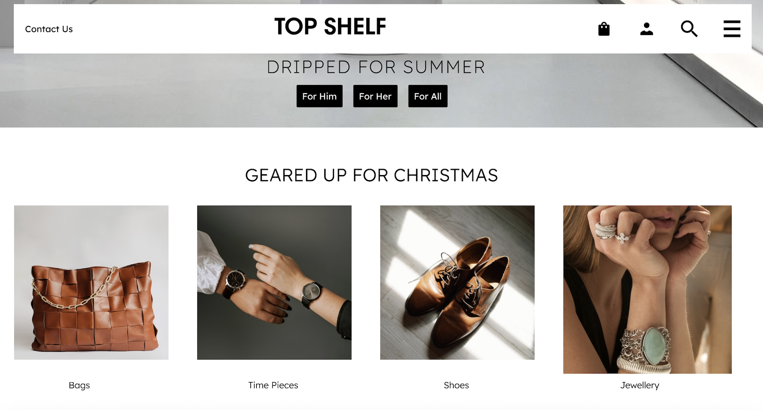
Design a hi-fi composition centered on image use in a product screen. Treat the images as functional UI, not decoration: they need clear placement, consistent sizing, and a reason to exist in the layout.
Show at least one primary image area and a smaller supporting image group. Decide which images are editorial, which are actionable, and which are purely contextual. Use crop, framing, and spacing to make that distinction obvious.
Include the states that usually get missed: a clickable image treatment, a captioned image, and an accessibility treatment for non-visual users. If an image is a link or opens a detail view, it should read that way without relying on hover alone.
The final screen should make the image hierarchy obvious at a glance. A viewer should understand what matters first, what can be clicked, and what needs text support.
What to deliver
- Place one hero image and 3 supporting images in a hi-fi layout
- Define image sizing, crop behavior, and aspect ratios
- Show at least one clickable image state
- Add captions or labels where image meaning is not obvious
- Include alt text treatment in the accessibility pattern
When choosing images for your design, think of them as storytelling devices. Each image should contribute to the narrative you're building, adding depth and context to the user experience.