Gallery
See what others have created
exhilaratingobelisk
@exhilaratingobelisk
Radio Button
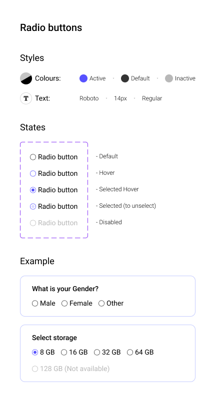
Design a radio button group for a settings form with 3–5 options. Each row should include the control, a primary label, and optional helper text underneath. Keep the layout tight and scannable, with consistent spacing between rows and clear alignment between the indicator and text.
Show the full interaction set: default, hover, selected, focus, and disabled. The selected state should be obvious at a glance, and the focus state should be visible for keyboard users. Disabled options should keep their labels readable while clearly signaling they cannot be chosen.
Treat the whole row as the target area, not just the circle. The control should feel easy to scan, easy to click, and consistent whether the group is short or long. If you include helper copy, make sure it does not break the visual rhythm of the list.
What to deliver
- Design a radio group with 3–5 mutually exclusive options.
- Show default, hover, selected, and disabled states.
- Include the selected indicator, label, and helper text treatment.
- Define spacing, alignment, and hit area for each row.
Utilize color and icons subtly to enhance the user experience without distracting from the purpose of radio buttons - a single, clear choice.