Gallery
See what others have created
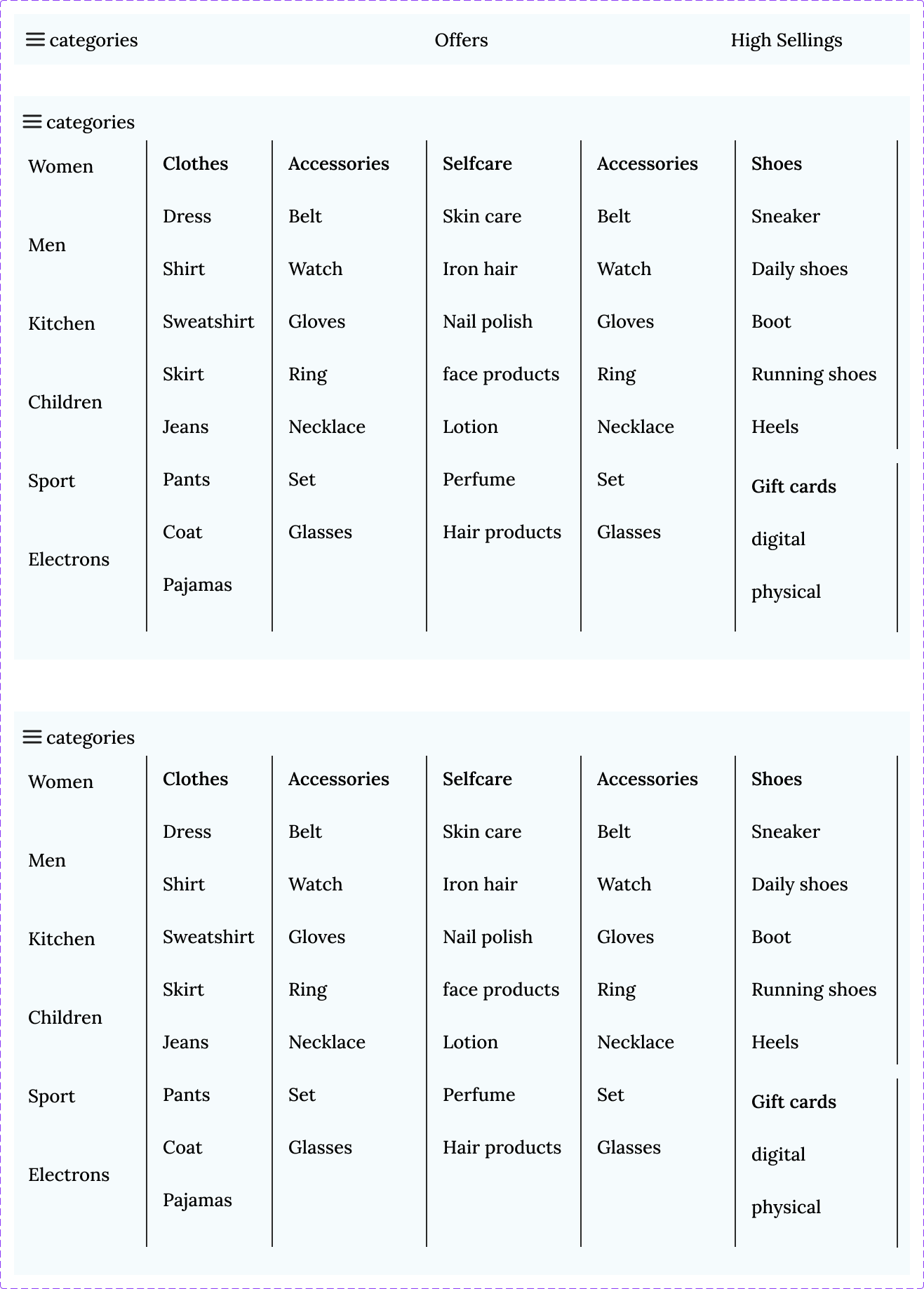
meow
@meow
Navigation Menu & Mega Menu
Design a desktop navigation bar with one mega menu expansion. The bar should show the site’s primary sections, one active item, and clear hover and focus states. Keep the top-level nav simple; the complexity belongs in the expanded panel.
Inside the mega menu, group links into labeled sections with a clear reading order. Include one featured block for a promoted destination, product update, or help link. The layout should make it obvious which links are primary, which are secondary, and where the user should click next.
Show how the menu opens and closes, and how it behaves when the pointer moves between the trigger and the panel. Add a collapsed or overflow treatment for tighter widths so the pattern still works when space is limited. Keep spacing, alignment, and hierarchy consistent across all states.
What to deliver
- Design the top-level navigation bar with active, hover, and expanded states.
- Design one mega menu panel with grouped links, section labels, and a featured area.
- Show the open/close behavior for desktop hover or click, including focus state.
- Include a collapsed or overflow version for narrower widths.
- Define the spacing, alignment, and hierarchy rules for menu items and groups.
Anchor your mega menu with recognizable icons and short, descriptive labels for quick user orientation.