Gallery
See what others have created
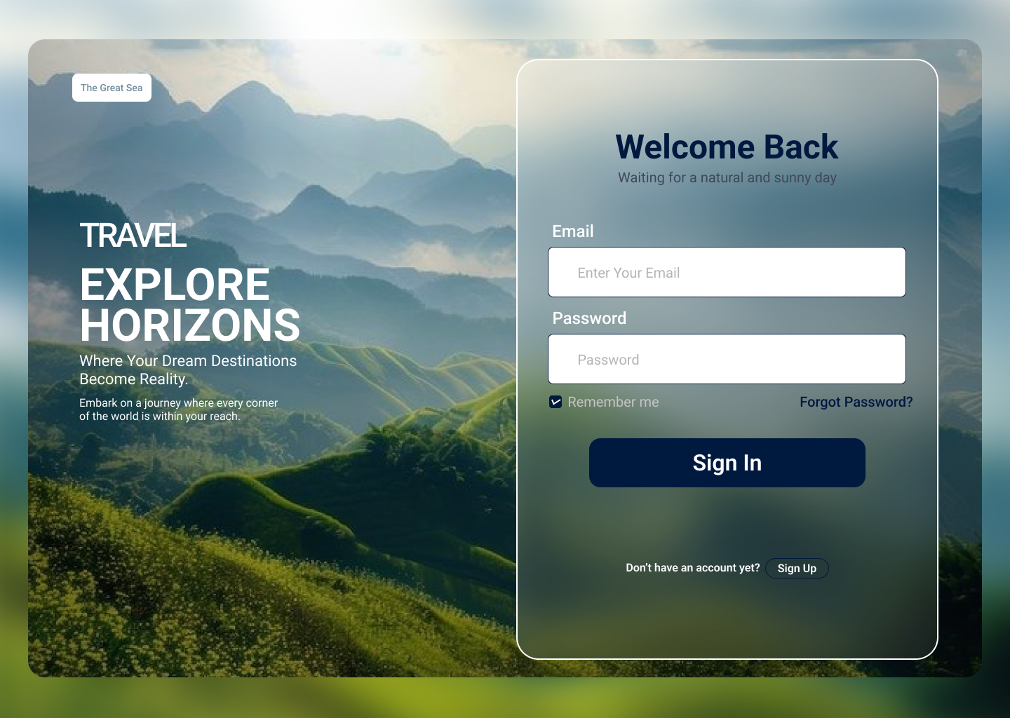
idealisticdaybed
@idealisticdaybed
Label
Design the label component used in forms and settings screens. This is the text that names a field, toggle, or control, so it needs to read clearly on its own and stay visually attached to the element it describes.
Show the label in a few real placements: above a text input, left of a checkbox or switch, and beside a field with helper text or validation copy. Include required and optional indicators, plus a long-label case that wraps without collapsing the layout.
Define the visual treatment for default, focus-linked, error, disabled, and success states. The label should change only as much as needed to communicate status; the control still does the heavy lifting. Keep hierarchy simple, spacing consistent, and the label easy to scan in dense UI.
What to deliver
- Design a single label component with text, optional required/optional indicator, and supporting hint.
- Show default, focus, error, disabled, and success variants.
- Define spacing, type scale, and alignment rules for labels above inputs and beside controls.
- Include one example of a long label and one truncated/wrapping case.
- Specify how labels behave with icons, helper text, and validation messages.
Infuse personality into your labels with typography that aligns with your design's overall theme, but never at the cost of readability. Play with font weights, styles, and colors to create a hierarchy and focus.