Gallery
See what others have created
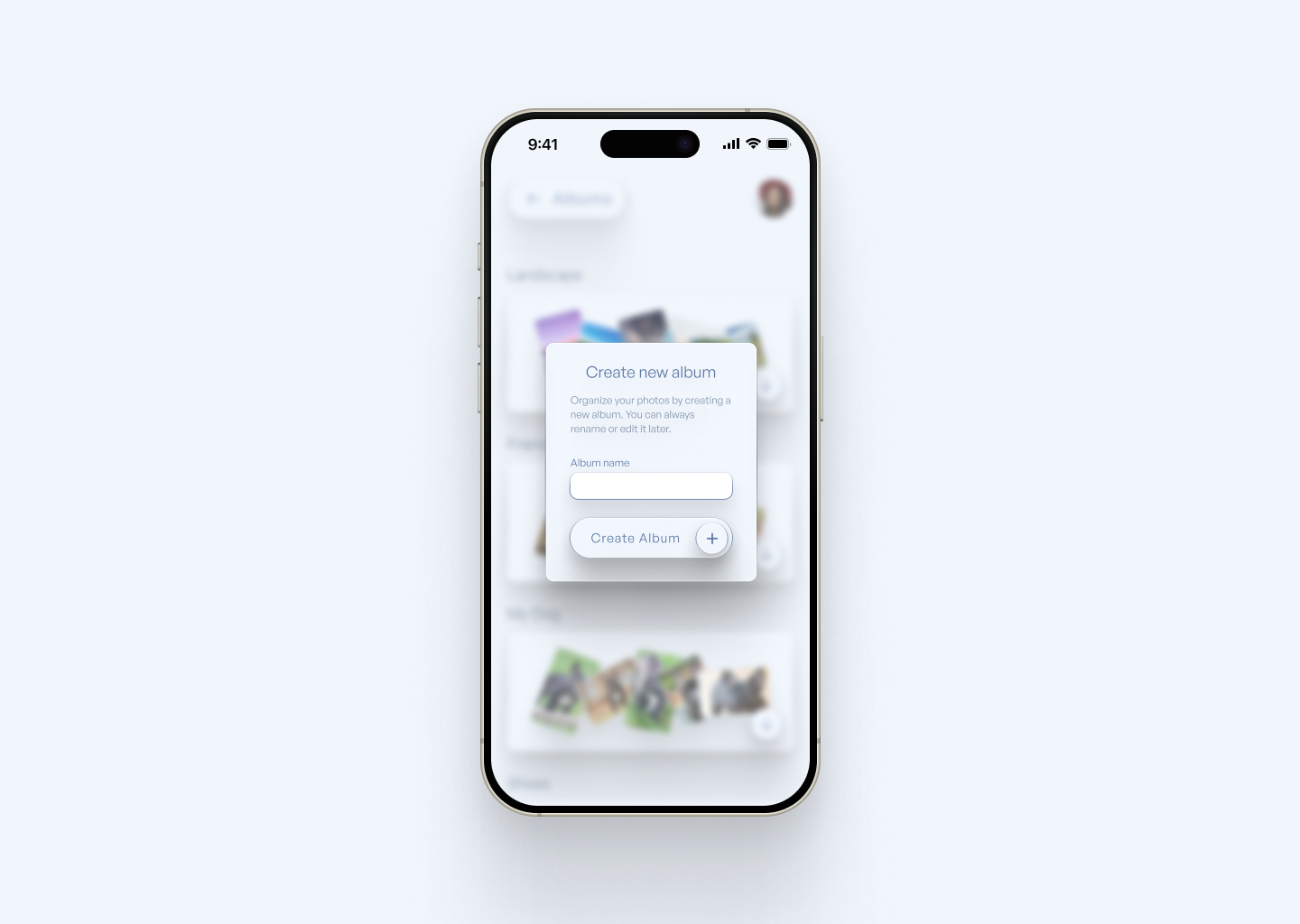
designeraleksa
@designeraleksa
Inline dialog
Design an inline dialog that appears attached to the content that triggered it, not as a full-screen modal. It should feel like a small interruption inside the page flow: enough contrast to demand attention, but still tied to the surrounding context.
Use it for short tasks only: confirming a change, asking one follow-up question, or collecting a single piece of input. Keep the layout tight. Include a title, a short supporting line, one primary action, and one secondary action to cancel or close.
Show how the dialog behaves when opened from different triggers, such as a table row, a settings item, or a card action. The anchor point should be obvious, and the rest of the page should remain readable behind it. If the dialog needs input, show the empty, focused, and error states with clear recovery text.
Treat dismissal as part of the design. Show what happens on outside click, escape key, and successful submit. The component should return the user to the same place in the page with no confusion about whether the action was applied.
What to deliver
- Design the inline dialog in its closed, open, and dismissed states
- Place a clear title, short body copy, and one primary action
- Add a secondary cancel or close action that is always visible
- Show how the dialog anchors to the triggering control or content row
- Include a focus state and keyboard-accessible close behavior
- Define a compact error or validation state if input is required
Leverage principles of progressive disclosure by revealing more information or options as needed without cluttering the initial view, making the dialog engaging and not disruptive.