Gallery
See what others have created
hatefulskirmish
@hatefulskirmish
Bleed
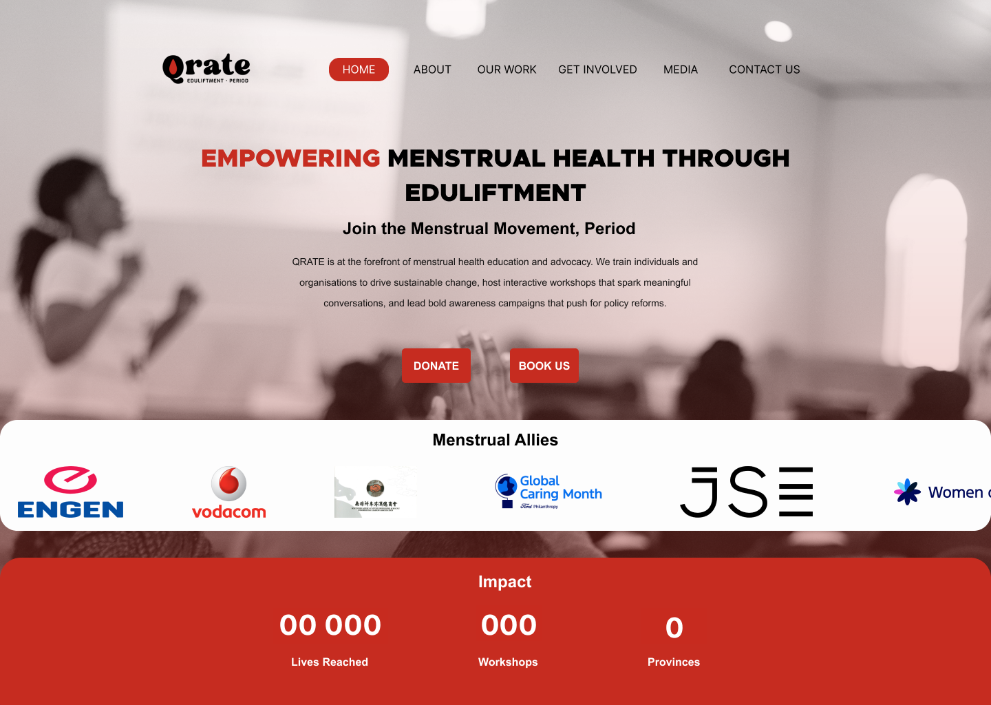
Design a component that uses bleed as a visual device: imagery, background color, or media should run to the edge of the card, panel, or viewport instead of sitting inside a neat box. The goal is to make the edge treatment part of the composition, not a bug to be hidden.
Build the component so it still reads cleanly where the content matters. Keep text, controls, and key metadata inside a stable safe area, while the visual layer can break the container with negative margins, cropped media, or an overlapping accent strip. Show how the component behaves when the bleed is clipped by a parent container and when it is allowed to extend fully.
Add one interaction that reveals the overflow on purpose, such as horizontal scroll, swipe, hover expansion, or a staged reveal on open. The user should understand that more content exists beyond the frame. Include the default state, the expanded or scrolled state, and any edge treatment needed for smaller screens.
What to deliver
- Design a component with at least one full-bleed visual edge.
- Show a safe content area that stays readable over the bleed.
- Create one interaction where content intentionally extends past the viewport or container.
- Include a cropped state and a fully revealed state.
- Define spacing, masking, and overflow rules for the component.
Add a playful touch by including design elements that 'peek' from the edges, suggesting they continue beyond the viewport - sparking curiosity and encouraging exploration.