Gallery
See what others have created
anuj_verma
@anuj_verma
Loading Dot & Spinner
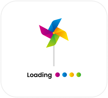
Create two loading indicators: a dot sequence and a spinner. Treat them as UI components, not illustrations. Each should have a default size, color token, and motion pattern that can be reused across the product.
Show the loaders in the states a designer would actually ship: idle preview, active animation, and reduced-motion fallback. Include examples on light, dark, and busy content backgrounds so visibility is tested, not assumed. The indicator should remain readable at small sizes and feel balanced when centered or used inline next to text.
Keep the motion simple and purposeful. The dot loader should communicate ongoing activity through rhythm or phase shift; the spinner should read as continuous progress without looking heavy or distracting. If you introduce brand styling, it should come through in shape, stroke, or color treatment, not in decorative effects.
What to deliver
- Design a dot loader with at least two motion states.
- Design a spinner loader with at least two motion states.
- Show default, light, dark, and high-contrast versions.
- Show inline and centered placement examples.
- Include a reduced-motion fallback state.
Inject personality into the loading indicator by considering the brand's identity. Quirky dots or a themed spinner can carry the brand's voice even through the waiting times!