Gallery
See what others have created
unpublishedhanging
@unpublishedhanging
Pull-down buttons
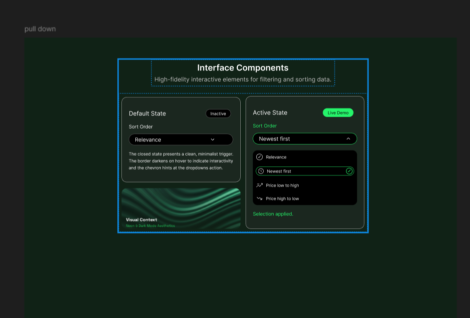
Design a pull-down button component for a product UI. Start with the closed trigger: it should show the current value, a clear affordance that it opens a menu, and a size that works in dense forms and toolbars.
Then design the open state. Show the menu anchored to the trigger, with a clear selected option, hover and keyboard focus states, and enough spacing to make the list easy to scan. Include at least one long option label and one disabled option so the pattern holds up under real content.
Cover the states a teammate would need to ship it: default, hover, focus, pressed, disabled, and open. If the menu can scroll, show that too. Keep the component consistent with the rest of the system, but make the interaction obvious even before the user clicks.
What to deliver
- Design the closed button state with label, chevron, and current selection.
- Design the expanded menu with at least 5 options and one selected state.
- Show hover, focus, active, and disabled states for the trigger.
- Include long labels, empty selection, and overflow handling.
- Add a keyboard-accessible open/close pattern and menu focus state.
Leverage familiar icons and animations to indicate that a button can be pulled down, providing a visual clue for users to interact with.