Gallery
See what others have created
hatefulskirmish
@hatefulskirmish
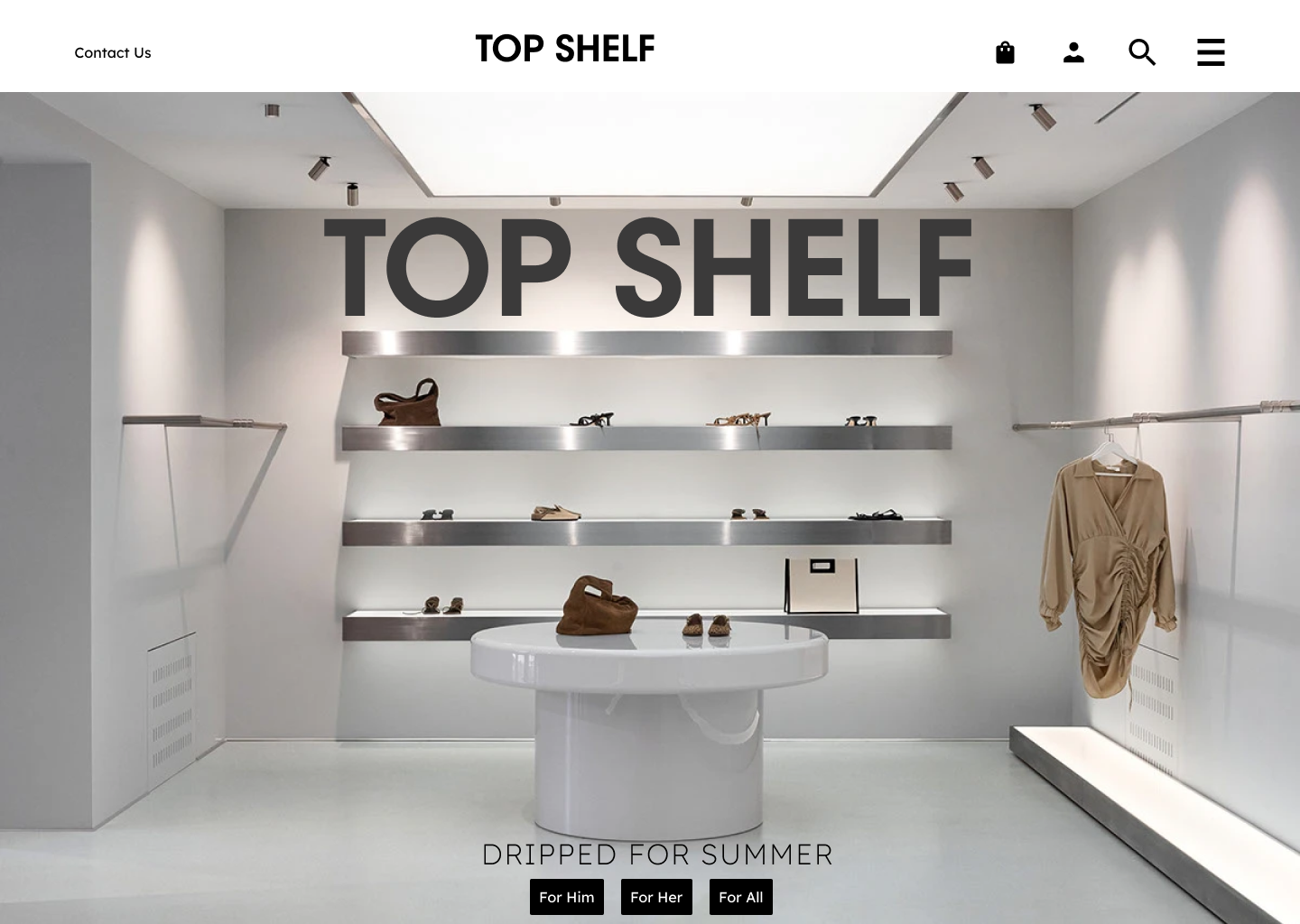
Top Bar & Navigation Bar
Design the product’s top bar and navigation bar as one connected header system. The top bar should carry the logo, current workspace or page context, and utility actions such as search, notifications, help, and account access. Keep the primary action visible only if it truly belongs in the header; otherwise, let navigation lead.
The navigation bar should make the product structure easy to scan. Group the main destinations into a clear order, use labels first and icons only as support, and make the active section impossible to miss. Hover and focus states should feel deliberate, not decorative. If the product uses sub-navigation, show how the header supports it without stacking too many competing controls.
Show how the header behaves at smaller widths. Define what collapses, what stays pinned, and how users still reach the current section and key utilities. The component should hold up in dense desktop layouts and in narrower windows without losing hierarchy or forcing awkward wrapping.
What to deliver
- Design a persistent top bar with logo, context, and utility actions.
- Design a primary navigation bar with 4–7 top-level destinations.
- Show active, hover, focus, and disabled states for nav items.
- Define collapsed behavior for smaller widths and narrow windows.
- Place search, notifications, and account controls without crowding primary nav.
For an engaging experience, animate the navigation bar interactions subtly, like using smooth transitions for hover and click states.