Gallery
See what others have created
designeraleksa
@designeraleksa
Image wells
Design image wells for a product form or content editor. Each well should accept one image, show a strong empty state, and make the add/replace action obvious. Treat the component as a repeated pattern, not a one-off gallery.
Show the full set of states: empty, filled, hover, focus, uploading, and error. Keep the same footprint across states so the form stays stable. If an image is already set, make replacement and removal available without hiding the preview.
Use a layout that works for one well or many: consistent crop, clear spacing, and a visible label or helper text when the image has a specific purpose. If the design supports multiple wells, make it easy to scan which slots are complete, which are missing, and which need attention.
Design for practical editing. If a user drags an image over the control, the drop target should be obvious. If upload fails, keep the selected file context and show the next step in place.
What to deliver
- Design a reusable image well component with one clear empty state and one filled state.
- Show how users add, replace, and remove images from each well.
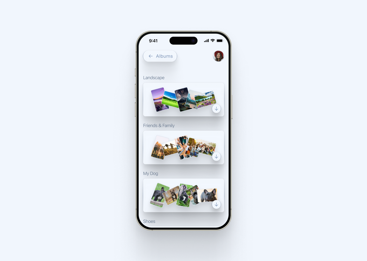
- Include a multi-image layout with consistent cropping, spacing, and labels.
- Add selection feedback for hover, focus, and active states.
- Handle overflow when there are more images than visible wells.
Infuse your image wells with a sprinkle of interactive elements, like subtle animations upon hover or selection, to delight users and enhance engagement.