Gallery
See what others have created
designeraleksa
@designeraleksa
Switching to Dark Mode
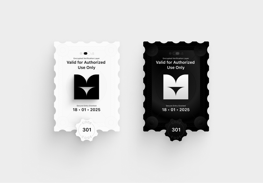
Design the interaction for switching a product from light mode to dark mode. Show where the control lives, what it looks like before activation, and how it behaves when the user toggles it. This is a flow challenge, so include the moment of change, not just a finished dark screen.
Show the theme shift on a real interface, not a blank sample. Use a screen with navigation, body text, secondary labels, icons, and at least one primary action so contrast and hierarchy can be judged after the switch. The dark version should feel intentional, not just inverted.
If the product supports it, include a system setting or auto-detect state alongside manual control. Keep the control understandable on its own, and make the current theme obvious at a glance. The result should show that the interface remains readable, balanced, and usable in both modes.
What to deliver
- Design the settings/control surface where dark mode is turned on or off.
- Show the toggle in its default state, active state, and after-state theme change.
- Depict the transition between light and dark themes.
- Include at least one screen with key content after the switch to verify contrast.
- Show the system preference state if the product supports it.
In dark mode design, consider using different shades of gray rather than pure black for backgrounds. This helps to reduce eye strain and allows for better depth with UI elements.